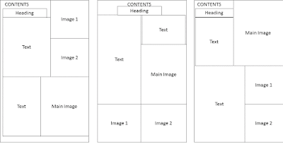
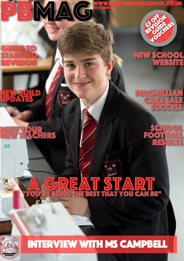
I have completed my final front cover for the school magazine. It is a slightly updated version in comparison to the previous one displayed on the blog, with the headline and strapline slightly enlarged in comparison to before. In comparison to the first draft, due to the positioning of the face, some of the text has been moved as to not cover the face in the main image. The text is mostly red, because this is the man colour that the school uses (on the badge/logo, website, documents) which means that is very fitting. The red shows that it is the school's magazine as the red is part of the school's image. The choice of a student (yr7-11) happy and with thumbs slightly visible s because it links with the headline of a great start - the photo shows that the student in the photo has had a great start to the year. It is even more fitting in that it is of a year 7 student as they are a new student. There is also a large banner at the bottom with white text that is mentioning an int...


