Posts

Showing posts from 2016

Music Magazine Mockup 5

Image

Music Magazine Mockup 4

Image

Target Audience for M4U

The target audience for M4U is males and females (50/50) aged in the 15-24, 25-35 and 36-50 age groups. The target audience will be interested in wide variety of music from multiple decades (80s, 90s, 00s, 10s) and will be interested in established artists but also interested in finding out about new artists. The audience are the kind of people who likely listen to music when they are working or doing other things. They may also (not necessarily) go to gigs, concerts or festivals. The audience are also likely to be interested in using multiple different mediums to listen to and access music - online streaming, downloads, CDs, etc. Their occupation is not important as they could have any job and still buy the magazine as it is reasonably priced for the audience (£4.99). They may also be in education. A lot of the audience would be using social media platforms such as Facebook and they may get music news from this platform. On the JICNAR scale, I would expect them to be B, C1, C2 and E (

Photography Thinglink

Image

Music Magazine Mockup 3

Image
In this mockup I have used a different image for the main image and also I have moved the coverlines and the pug to different places on the magazine.

Mockup 1 modifications

Image
I have modified the first mock, trying two different layouts (the positioning of headline, strapline and pug as well as removing it one of the mocks). This involved moving the main image slightly to allow for testing of these layout sketches.

Photoshoot Plan - Front Cover

Time & Date Shot type Location & Lighting Props, costume, hair Character used Preferred time and date - 6/12/16, lunch time MS A room with a white or grey background, potentially the drama room but other rooms are possible. Lit so there IS NO shadow of the character. No props Not 'casual' but not 'smart' clothes. In between. Potentially wearing jeans. The shirt or t shirt must not have any identifiable branding visible*. The whole body is looking directly at the camera.  Preferred time and date - 6/12/16 MS A room with a white or grey background, potentially the drama room but other rooms are possible. Lit so there IS A shadow of the character. Potentially a microphone. Not 'casual' but not 'smart' clothes. In between. Potentially wearing jeans. The shirt or t shirt must not have any identifiable branding visible*. Standing looking at the camera, but the rest of the body is not looking directly at the camera. P

Music Magazine Mockup 2

Image

Music Magazine Layout Sketches

Image

Brand values and ideology for M4U

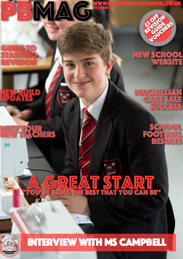
My magazine is called M4U. It is aimed towards fans of pop, rock, alternative and indie music - ranging from the 1970s to the present time. It values all of the potential audience's opinions and views on music. In addition, M4U will support established and new artists and promote their work, to allow them to get their music out to the intended audience. In addition to this, it values all ways of getting hold of or accessing music - physically, such as a CD or digitally, such as on streaming services. As well as this, it supports, promotes and values music events - such as gigs/concerts and festivals. The intended audience for the magazine is for 18-65 year olds, allowing the younger audience to learn about and appreciate older music and artists and how it has influenced newer music as well as allowing older members of the audience the ability to learn more about newer music. M4U values how people access the magazine as well, selling it in shops, online, and via subscription - to al

Music Magazine Mockup 1

Image

Music Magazine Photography Plan

Photography for the main image. Look of the person: The person needs to be looking confident, as they are going to be a new artist, and showing confidence shows that they will be good at it. Background: The background can be any colour except cream or red, due to the masthead colour. The background could be red with the masthead colour changed to either black or white, which are the other two colours that should be prominent throughout the magazine. Not taken in school environment as unrealistic.

Masthead Feedback

Feedback 1 (second across from top): It's incredibly eye catching, stands out to the audience.  Feedback 2 (bottom right): Stands out as each letter is different, though the could have better choice of colour.  Feedback 3 (second rown, far right): Stands out well, and the colours suit the font used.  Feedback 4 (third row, far right): Font is bold and easy to see, however it could use a more vibrant colour.  Feedback 5 (third row, far right): Stands out and is prominent. Feedback 6: I do like the one in the bottom right but I feel for that to be a success it'd need to be brighter. And third row down middle is another good one but the colour could be a tad lighter. But if I had to choose one I think it'd be bottom right but with a lightish red colour because it's big, it's bold and it's unusual so I think it'd stand out well.  Feedback 7 (second row, centre): Terrible. Due to transparent centre it won't stand out enough over the top of images.  Feedback 8

Brand identity and ideology of Q Magazine

Image
Q Magazine values a variety of music, such as rock and pop. When it was first created, its creator even made this clear when they said "Magazines tend to bracket people by taste, or what they assume that taste to be. This is a magazine that doesn't." As can clearly be seen from the front covers, it covers a variety. There are famous artists from multiple genres. They value their audience and want to be a magazine for all.   Q believes that all music is important and that everyone should be able to find out about that music in one place rather than just sticking with one genre or style or having to purchase multiple magazines. The magazine has a specific colour scheme, using largely red, black and white - although other colours are used. This is because they feel that they should be recognisable as Q and they make their brand easy to recognise. The masthead is always located in the same place, and the colours rarely deviate. This means that they have a house style and that

Moodboard

Image

Masthead Ideas for Music Magazine

Image
These are my masthead designs for the M4U music magazine. I particularly like the masthead on Row 4, third across. This is because this masthead seems different compared to the other mastheads, with the text being different lengths. I do however feel that a different, brighter and more clear colour could be used to allow the magazine to stand out more. Below is a list of the fonts that have been used for the mastheads. Fonts (l-r) Row 1: 1 - Lucida Grande 2 - Lifestyle M54 3 - Kannada MN Row 2: 1 - Euphemia UCAS 2 - Blackout 3 - AppleGothic Row 3: 1 - Ingrata Regular 2 - Prototype 3 - Kakawate Font Row 4: 1 - Pocket Thrilled FP 2 - The Outbox St 3 - Stentiga Later addition to Mastheads (03/17):

Contents page for school magazine

Image

Music magazine name ideas and introduction

I haven't specifically chosen a genre, it part due to my own interests and the fact that there will be people out there who like to have multiple interests - or maybe specifically in artists. As in, an artist may start with genre and then their style changes over the years - e.g, they may have started with rock and as time progressed their music gets more into the pop genre or vice versa. This means that people with a variety of tastes in music or who like an artist who has changed will be able to just have one magazine. In addition, this means that the magazine will cater for a much wider audience. Name possibilities Music4U M4U Variety Music Now MaxMusix MaxMusic

Music Magazine Analysis

This is an embedded Microsoft Office presentation, powered by Office Online . This is an embedded Microsoft Office presentation, powered by Office Online .

Contents page conventions

Contents pages exist to tell you what is in a magazine. They provide the page numbers of where different articles are located in the magazine. They are based on a grid structure and rulers are used to line them up correctly. They are made of 1 or 2 columns, and these will have subheadings for each column. Numbers are used to locate where different things in the magazine are located, these are the page numbers. There may also be photos of content with captions which are used to engage the audience more. If the photo is large, the more important it is to the issue of the magazine. Articles and features use larger, bolder text.  Underneath each article or feature name is a blurb which gives a small amount of information on what the article or feature is about. There may also be an editors letter or a section with information on the magazine subscription.

Rule of Thirds

Image
The rule of thirds is one of the main rules when it comes to photography. It comes from the theory that the human eye naturally gravitates to certain points in an image. It is actually the most known rule of photography. With the rule of thirds, photographs are divided with two imaginary lines horizontally and two vertically, splitting it into three rows, three columns and nice sections. Important elements of the photograph should be placed on or near the imaginary lines on the image. Some examples: With landscapes, it is better if the horizon falls on the top imaginary line or the bottom imaginary line as opposed to directly in the centre (which is natural) With portraits, it is best if the eyes are located where the horizontal and the vertical lines intersect. Photos look better when they are located off centre.

Final school magazine front cover

Image
I have completed my final front cover for the school magazine. It is a slightly updated version in comparison to the previous one displayed on the blog, with the headline and strapline slightly enlarged in comparison to before. In comparison to the first draft, due to the positioning of the face, some of the text has been moved as to not cover the face in the main image. The text is mostly red, because this is the man colour that the school uses (on the badge/logo, website, documents) which means that is very fitting. The red shows that it is the school's magazine as the red is part of the school's image. The choice of a student (yr7-11) happy and with thumbs slightly visible s because it links with the headline of a great start - the photo shows that the student in the photo has had a great start to the year. It is even more fitting in that it is of a year 7 student as they are a new student.  There is also a large banner at the bottom with white text that is mentioning an int

Possible images for the school magazine contents page

Image
Screenshot of the website (relating to the article about new school website)

School Magazine Contents Page Layout Sketches

Image
The images below show my layout sketches for the contents page, on the school magazine. Each one contains room for a main image and two smaller images (though one of the smaller images could be removed to allow for more text).

School Magazine Front Cover Final Draft

Image
With the final draft I have changed to my real main image, this will be used on the final front cover for the school magazine. Some of the text has been moved so it does not obstruct the face on the main image in comparison to the first draft. The only issue with this is the smaller size for the headline and coverline. This is because of image positioning not being complete checked and this will be fixed in the final front cover.

Photos for the school magazine

Image

School Magazine Draft 1

Image
This is my first draft. It contains all of the content that will be on the final front cover, except the main image. The main image will be replaced and the content will be slightly reorganised to fit around the main image for the final magazine cover. All of the text, features, the headline and the strapline will be featured on the final front cover for the magazine, but as noted above, may be slightly moved around and reorganised to allow them to fit around the main image. The main image will be taken on Monday 10th October with the final front cover finished by Thursday 13th October.

Photography Plan

Image
OPTION 1 Where: LRC or Outside front of school Wearing: School uniform Doing: Thumbs up Camera shot: Medium Close Up OPTION 2 Where: LRC Wearing: Student in school uniform Doing: Reading revision guide Camera shot: Medium Close Up E.g. Similar to below (previously analysed) but with revision guide and Plantsbrook uniform.

School Moodboard

Image

Conventions of a magazine front cover and contents page

Image
Front Cover A masthead for the school magazine. A headline, which is about the main feature in the magazine. A strapline, talking about the headline's article. Coverlines, which give the audience an idea of what is in this issue. Pug/Starbust, something that stands out to the audience so that they are more likely to read it. A main image. Usually about the article the headline talks about. Date if issue. A variety of font sizes (masthead will have large font, headline large font, streamline and cover line smaller). Price. Contents Page   Some images about the articles in the magazine. A table of contents, which includes captions giving the audience and idea about what the article is about. Page numbers and information as to what articles are on the page. Captions for the images on the contents page. Columns

Contents of a School Magazine

The school magazine is likely to include things such as: Interviews with teachers/staff. Letter from headteacher/deputy/assistant. School sports team fixtures. Help/guides for revision and exams. School events. Information on the new build.

Target Audience for School Magazine

The target audience for a school magazine would be students at the school, parents/carers, and staff at the school. The target audience would be aged between 11-18 (students) and 25-65 (staff and parents/carers). This means that the magazine has to cater to a wide audience. These people are likely to be interested in the school and be in the local community.

More Masthead Ideas

Image
Chosen due to being modern, which when the school gets the new building, it will be, This is fitting as it is a school and therefore a handwritten font represents writing in a exercise book.

Analysis of a School Magazine Contents Page

Image

School Magazine Mastheads

Image
Mastheads for the school magazine.

Layout Sketches for a School Magazine

Image

Analysis of existing school magazines

Scribe Analysis of Existing School Magazines NEW Onedrive version (older) This is an embedded Microsoft Office presentation, powered by Office Online .

Possible names for my school magazine

After thinking, I have come up with some names that could be used for my school magazine. PB Mag Plantsbrook Monthly Plantsbrook Mag PB Student PbM  PB Monthly YourPB The Brook Mag Plbr  Plantsbrook Magazine

Music Magazine Analysis

Image

Masthead research and analysis

Image
This is the masthead for NME. It uses a bold, sans-serif font which is modern and informal. The colours are contrasting and eye catching, with red, white and black being a large contrast from each other. There is also a drop shadow separating the white and the red. This makes it stand out to the audience when they see the magazine. It acts as a logo and is placed at the top of the magazine. It is largely associated with rock, alternative and indie music. So that will be their audience. The Kerrang! masthead uses a sans-serif font. it is bold and is mostly a white colour, however it is not a uniform fill as it has the black lines going through it making it a pattern fill. It acts as a logo and is placed at the top of the magazine. The magazine itself is aimed at rock music fans. The Q masthead is very simple. It's a white Q on a red background. On the lower right of the Q, there is a drop shadow that can be seen on the red background. In addition, the font is serif. The magazine is