Summer Homework
Film 1 (Q1/2) - American Film
Poster
Media Language
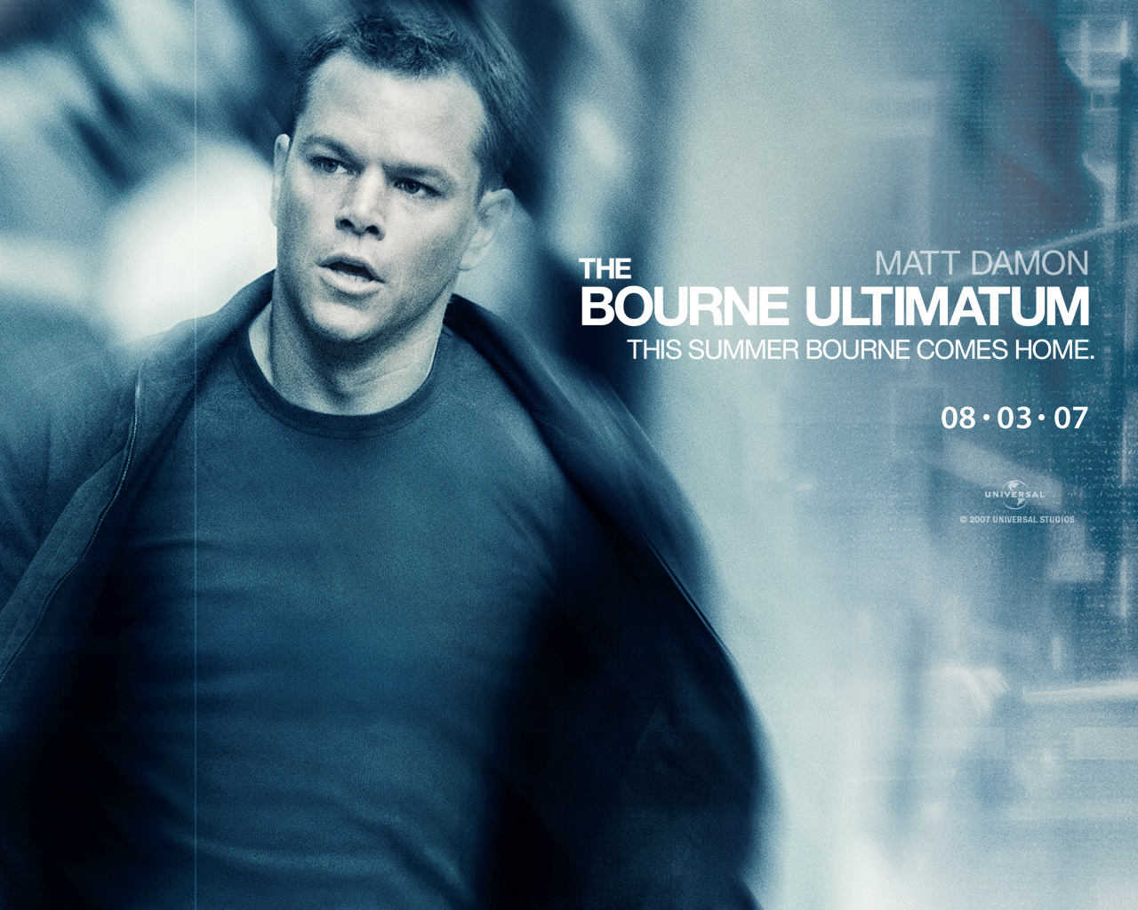
The title is written in the largest font, with 'the' being slightly smaller. In addition, the title has three words, with multiple words being common for this genre of film. This is also a convention that has been followed throughout the film series because the names of the films are identical to the names of the books that they are based on - with the last word changing for each film. The use of the same words at the start of the title will, therefore, make the poster stand out to people that have seen the previous films and motivate them to go and see the new film. In addition, there is a strapline at the top - which refers to both the release date and the film and also links nicely with the image that has been used. Straplines are often like this, with "this summer" or "this autumn" often being used.
Mise-en-scene
The two posters that I have uploaded are very different. The first shows the back of Bourne's head and a city. Bourne is facing the city, instead of the camera, showing that he is returning to the city from somewhere else. In addition, whilst there are no visible facial expressions, you can clearly see that Bourne is standing upright, which suggests that he is ready for something.
In the second poster, we see Bourne facing the camera. His jacket appears to be coming off, which could suggest that he is moving, and he also looks slightly tired, which could suggest that he has been doing something (potentially what he was looking ready for in the first poster). It looks as though he's walking, and his face is turned slightly to the left, which could suggest that he is talking to someone.
Representation
The representation is different in both posters. The first poster shows that Bourne is ready for something, whatever that may be. Whilst the second poster seems to represent the action of the film. The first poster also shows a setting for the film, whilst the second one doesn't. Both posters clearly represent Bourne as the main character, which is true.Images & Camera
Both posters feature the main character, which the film (and series) is named after). The first one links well with the strapline, with an image of Bourne in front of his 'home' - with him facing it, to show that he's returning. The second poster shows a slightly blurry image of Bourne facing the camera. The blur could suggest that the film is an action film, which it is, due to images often becoming blurred when there is action in them.
Magazine
Trailer
Media Language
Media Language includes the text that is seen at the start of the trailer, which refers to the events of the previous films in the series. This could have been used to make people who have seen the previous films think about those, and then want to know what happens next in the story.
Sound
The trailer uses non-diegetic sound, that gets faster and then fades out and slows down nearer to then. The music is repetitive near the end, which could be to build up suspense - especially during the scene where they are talking on the phone. The fast paced nature of the sound links with the fact that the film is an action film.
Images & Camera
The trailer uses a variety of shots, including close ups, medium long shots, over the shoulder shots, two shots and long shots.
Mise-en-scene
The mise-en-scene gives a feel for what the film is like, showing things such as car chases, fights and also other important events. In addition, it shows weapons, such as guns, which feature prominently in the film. This shows that this is an action film. This is particularly evident after Bourne speaks.Editing
The trailer features a lot of quick cuts, between various action scenes within the film. This is typical of films of this nature because it shows the action.
Question 3
The posters, for sure, definitely have links. For example, the font used and the colours used are the same. This allows for some uniformity across the brand/franchise of the film and makes it obvious that it's the same film.
The magazine, however, is completely different to the posters. This may be because other films are also featured on the front of the magazine, and therefore less uniformity is present. It also worth noting that the magazine is published by a completely different company to the film's production company and studio, which may also have something to do with this.
The trailer links with both posters. For example, when Bourne first speaks in the trailer, he seems still, a lot like he does in the first poster. And then later, we see action which links with the second poster. This could have been done on purpose, to link the films with the posters or to show that whilst the film is mostly action, there are a few others parts in there which lead onto the action.
Mise-en-scene
The mise-en-scene gives a feel for what the film is like, showing things such as car chases, fights and also other important events. In addition, it shows weapons, such as guns, which feature prominently in the film. This shows that this is an action film. This is particularly evident after Bourne speaks.
Editing
The trailer features a lot of quick cuts, between various action scenes within the film. This is typical of films of this nature because it shows the action.
Question 3
The posters, for sure, definitely have links. For example, the font used and the colours used are the same. This allows for some uniformity across the brand/franchise of the film and makes it obvious that it's the same film.
The magazine, however, is completely different to the posters. This may be because other films are also featured on the front of the magazine, and therefore less uniformity is present. It also worth noting that the magazine is published by a completely different company to the film's production company and studio, which may also have something to do with this.
The trailer links with both posters. For example, when Bourne first speaks in the trailer, he seems still, a lot like he does in the first poster. And then later, we see action which links with the second poster. This could have been done on purpose, to link the films with the posters or to show that whilst the film is mostly action, there are a few others parts in there which lead onto the action.
Film 2 (Q1/2) - British Film
After much research, I am able to complete the work for a British film. The amount of research required proved to me how much more well known American films are, because i've had to go with a British film that I have never heard of.
PLEASE NOTE THAT I HAVE GONE FOR A FILM THAT DOESN'T HAVE A MAGAZINE COVER! THIS IS LIKELY TO BE BECAUSE THIS FILM WASN'T RELEASED AT THE TIME OF COMPLETING THE WORK.
.jpg)
PLEASE NOTE THAT I HAVE GONE FOR A FILM THAT DOESN'T HAVE A MAGAZINE COVER! THIS IS LIKELY TO BE BECAUSE THIS FILM WASN'T RELEASED AT THE TIME OF COMPLETING THE WORK.
Poster
Media Language
The title is written in a large red font, and is directly in the centre of the poster. The type of font is very common when it comes to action films. The actors in the film are above this, in a smaller font. These could have been placed here to get fans of these actors interested in the film and make them want to see the film.
Mise-en-scene
The poster contains two main images. The one at the top shows a man, presumably the main character, holding a gun. The second shows what looks like a beach, with an explosion happening on the left and a boat on fire on the right. In the centre, we see the same man, holding a guitar (he is a rock star) holding a gun.
Both of these images seem to follow a common convention across action films, with explosions and guns featuring in them.
Both of these images seem to follow a common convention across action films, with explosions and guns featuring in them.
Representation
The representation shows that, in my opinion, the character is ready for anything. This can be seen mainly in the second image, where it looks as though he could potentially have caused the explosion and fire but the damage doesn't really bother him based on his stance and look.Images & Camera
The poster features two images of the main character. The first image shows a close up of his face, maybe to show his expression but also the gun. The second shows a medium shot of him, walking away from some chaos (the explosions and fire) that he has seemingly caused.
Trailer
Media Language
There isn't much text, however there is a list of films that the director has previously worked on. This could potentially be to lure in people that have seen those films. There is also text near the end of the film that gives names of actors, possibly to lure in fans of those actors and also the name of the film in large text.
Sound
There is a non-diegetic soundtrack that gets fast and then also stops during various conversations. There is narration from the main character, or what seems to be narration, and later on there are conversations.
Images & Camera
The trailer uses a variety of shots, such as over the shoulder, establishing, close ups, different medium shots and long shots.
Mise-en-scene
The mise-en-scene gives a feel for where the film is set and the kind of people that are involved. For example, the costume worn by the main character gives evidence of the fact that he is a rock star. In addition, there are guns seen in the film, which show that its an action film. However, in my opinion, there seems to be too much conversation which detracts from the fact that its an action film.
Editing
Editing
Lots of quick cuts, potentially to show the action.
Question 3
In my opinion, the two don't have links. There are things that are similar, such as the font used on the poster and in the trailer, and there is also the continuous usage of the colour red.
In my opinion, there is poor continuity between the trailer and poster, but that may have been because the poster was released a long time before the trailer. In addition, there may have been other posters that I haven't come across online, because I certainly haven't seen them when out.
The reasoning behind this could've been the budget because it may also have been to do with the target audience. The film came up after a search online and I found it interesting, I had never heard of it before, which could be proof of this, which could have something to do with the target audience and the poster and trailer seemingly being different
Question 3
Question 3 can be seen underneath each films section.
Comments
Post a Comment