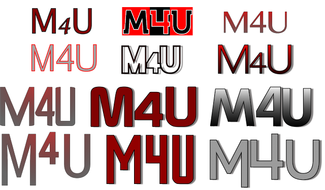
Masthead Ideas for Music Magazine
These are my masthead designs for the M4U music magazine. I particularly like the masthead on Row 4, third across. This is because this masthead seems different compared to the other mastheads, with the text being different lengths. I do however feel that a different, brighter and more clear colour could be used to allow the magazine to stand out more.
Below is a list of the fonts that have been used for the mastheads.
Fonts (l-r)
Row 1:
1 - Lucida Grande
2 - Lifestyle M54
3 - Kannada MN
Row 2:
1 - Euphemia UCAS
2 - Blackout
3 - AppleGothic
Row 3:
1 - Ingrata Regular
2 - Prototype
3 - Kakawate Font
Row 4:
1 - Pocket Thrilled FP
2 - The Outbox St
3 - Stentiga
Later addition to Mastheads (03/17):


Comments
Post a Comment